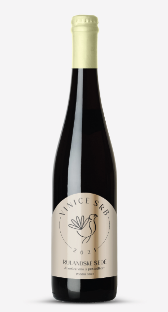
Vinice Srb
I had the incredible opportunity to collaborate with Vinice SRB on a rebrand that captures the essence of their exceptional wines. The project involved Creating a logo based on the client’s expectations of elegance and tradition while incorporating the imagery the client envisioned and reimagining the wine labels for their white, red, and rosé wines, each with unique character and personality.
Logo Design
At the heart of this rebrand is a meticulously hand-drawn bird encased within a fine line circle. This bird symbolizes Vinice SRB's commitment to tradition and the art of winemaking. Just as a bird takes flight, I aimed to design labels that would transport wine enthusiasts on a journey of flavors and experiences.
Colour scheme
For the rebrand, I introduced three distinct color schemes, each carefully chosen to complement the unique character of the wine it represents. The white wine label exudes purity and freshness, the red wine label embodies depth and passion, and the rosé wine label celebrates life's beautiful moments. The color schemes were meticulously selected to reflect the essence of each wine, creating a visual harmony with the flavor profile.


